NEW
With the aid of the Widget Configuration view it is possible to determine the appearance of your Questions very easy. The view is located in the navigation bar on the left-hand side when you enter a Product Guide.
Table of Contents
Old Configuration
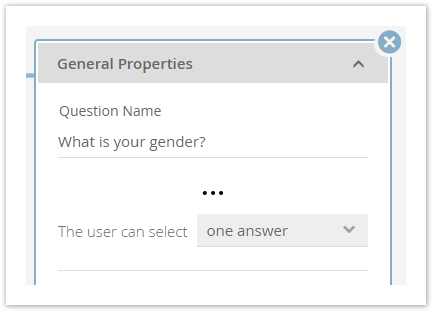
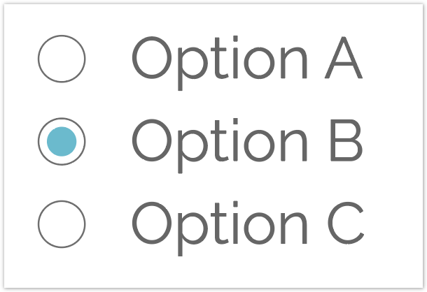
In earlier versions the Question appearance was determined by its settings in the Concept Board. That means, if you are select that the user can only choose one answer for this Question, it was always converted into a Radio Button group (see mockup).
|
|
| One Answer selection in the Concept Board | Radio Buttons representation in Product Guide |
As a consequence without customizations, coming from excentos, it was not possible to get e.g. tiles with decoration images, a slider or checkboxes for this configuration.
That resulted in the following issues:
- Less flexibility for the user
- Higher effort for excentos
- Longer waiting time to get the desired widget appearance
- More monotonous product advisors
- Higher rates of errors after adapting the Product Guide configuration
New Configuration
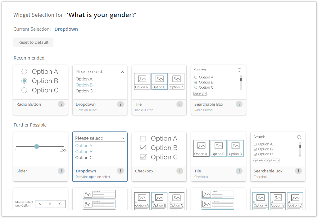
With the Widget Configuration view the previously mentioned issues can be solved. Now the user get an overview of all widgets which are allowed for the current Question configuration (see image below).
Here you can see that the widget "Dropdown" is selected for the Question "What is your gender?".
How does it work?
Each Question gets its own individual widget list. This list is calculated by our internal recommendation engine based on the Question configuration. That means that the view provides you not just all possible widgets, they are sorted by a fit score. This score results from the individual Question configurations (e.g. depending on the answer option type or single vs. multiple option selection).
Furthermore the widgets are divided in sublists. These lists are "Recommended", "Further Possible" and "Not Supported".
Recommended
- This sublist contains the best possible widgets for the Question.
- Usually, these are the most used and best fitting widgets for the configuration.
- Additionally the internal order can also contain a recommendation. The further left the better; except all have the same fit score.
- It contains the default widget. This is always the most left one in the recommendation list.
Further Possible
- Widgets which can be displayed but a) have disadvantages to the recommended widgets or b) are rarely used are part of this list.
- A disadvantage could be:
- Uncommon design pattern (e.g. using Radio Buttons for multi selectable Questions)
- Reasons for rarely used:
- Widgets which are used for one specific use case which cannot be decided by the configuration itself (e.g. displaying an enumeration list).
- Widgets which need additional custom content to look like expected.
- All of them have a lover fit score than the widgets from the recommended list and are internally sorted by this score. That means the further left the better.
Not Supported
- All widgets which are not part of one of the above sublists are placed in this list.
- These widgets do not fulfill the configuration requirements and as a consequence cannot be used for the Question.
- That is why this list is not visible in the view.
View Structure
The view is segmented into 3 main parts:
These segments have a logical order. That means that you should first select the right theme, then the Question and afterwards the widget.
Theme Selection
Each theme contains a different set of widgets. Hence not every widget is available in one theme. Therefore please make sure that you have selected the right theme before you start choosing your widgets.
Note
All widget changes are stored automatically after the selection. So do not be afraid to change the theme. No selection will be lost.
Question Selection
On the left-hand side within the blue bordered box you can select a Question. These Questions are structured within a tree layout. That means that like in the Language view you can navigate through the Stages to find the right Question.
Furthermore you can use the search bar to find a Question quicker by typing the name.
Note
The corresponding Answer Options are displayed but disabled (means not clickable). They should help you to remember the Questions' use case and decide which widget is the most suitable.
Widget Selection
Next to the question selection, the widget selection card is positioned (see image in New Configuration). It is the main part of the view because it contains all selectable widgets for the selected Question.
The card includes the following components:
- Card Title:
It contains the name of the selected Question. - Current Widget Selection:
Displays the current selected widget for the Question. - Reset Button:
Clicking this button resets the widget selection to the default widget of the Question. - Recommended Widgets List:
Contains all widgets which are the best fitting for the current Question configuration. - Further Possible Widgets List:
Contains all widgets which are permitted for the current Question configuration, but may not the best choice. - Question Information:
Includes some addition Question information
Widget Card Structure
Each widget card has the same layout components.
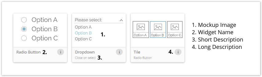
- On top you can see a mockup image of the widget. This image contains the main elements of the widget. These serve for identification and comparison with others.
 Note: The image is not a real representation like in the client theme. That means that it can look different in the various themes.
 - Below the image the widget name is placed. That is the common name excentos uses for this widget.
- The short description contains some detailed information about specific widget functionalities or additional elements. If the widget has neither of them, this label is invisible.
- For dropdowns a functionality could either be "Close on select" (closes the answer option selection after one option was chosen) or "Remains open on select" (answer option selection is not closed after an option selection).
- For tiles the information "Radio Button" or "Checkbox" is displayed because that is the only difference for these widgets.
- The long description becomes visible by hovering over the info button. It contains more detailed information about the widget.
Default Widget
The default widget is the first selected widget for each Question and is always visible as the first widget in the Recommended list. The selection is based on the Question configuration. You can always go back to this widget by clicking the "Reset to Default" button.
This widget also serves as a fallback widget. That means that if the Question configuration changes drastically and the current manually selected widget is not part of the Recommended or Further Possible list anymore, your widget selection is automatically adapted to the new default widget of the new configuration. In this case, a popup notification appears, e.g. in the Concept Board, and tells you the described case.
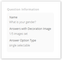
Question Information Card
The question information card is located on the right-hand side of the widget selection card. The following information should help you to decide which widget is the best choice for the Question.
- Name:
Name of the Question for a better identification - Answers with Decoration Image:
Number of decoration images which are set for all Answer Options of the Question. That information can be used e.g. to decide whether a widget with a displayed image (Tiles) is a good selection. - Answer Option Type:
Information about the core Question configuration settings. Here you can see if a Question is ordered, numeric, single, multi or range selectable.
I see no widgets in the view. What can I do?
That can have two different causes:
- You have not added any Questions to the Product Guide. In this case, please go to the Concept Board and click on a "Add new Question" button within a Stage card.
- Your selected theme do not contain the widget configuration information yet. Please contact us and we will solve this problem for you.
Is it possible to select custom widgets?
Yes, that is possible. If you are using your custom theme which contains your own custom widgets, they are displayed like any other widgets in the overview.
Note
Of course these widgets are only visible and accessible in your account and theme.