...
- Stage Name: Label name of the corresponding Stage
- Explanation Title: Information title of the Stage
- Explanation Text: Information text of the Stage
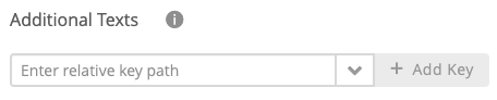
Furthermore, it is possible to add specific text keys. These keys can be part of theme customizations and are therefore not available/useful for all Workbench users.
| Info | ||
|---|---|---|
| ||
Common text keys can be found in the combobox right next to the input field. For further specification, please contact our excentos support. Example The contentItems.description key sets the description text for the widgets Tile with Description and Option with Description in the River theme. |
| Anchor | ||||
|---|---|---|---|---|
|
...
- Question Name: Label name of the corresponding Question
- Positive Reason Text: Text that occurs if a product fulfills the user's given Answer Option of the Question
- Negative Reason Text: Text that occurs if a product not fulfills the user's given Answer Option of the Question
- Unknown Reason Text: Text that occurs if a product has no information about the user's given Answer Option of the Question
- Explanation Title: Information title of the Question
- Explanation Text: Information text of the Question
As for the Stages, additional text keys can also be added for Questions.
| Anchor | ||||
|---|---|---|---|---|
|
...
- Answer Option Name: Label name of the corresponding Answer Option
- Positive Reason Text: Text that occurs if a product matches one of the connected product values of this Answer Option
- Negative Reason Text: Text that occurs if a product not matches one of the connected product values of this Answer Option
- Explanation Title: Information title of the Answer Option
- Explanation Text: Information text of the Answer Option
As for the Stages, additional text keys can also be added for Answer Options.
| Anchor | ||||
|---|---|---|---|---|
|
...
The listed attributes were added in the Recommendation Config view (see Configure the Recommendation Cardsrecommendation cards). You can translate the prefix text which is displayed in front of the data-dynamic product value.
...
- Preview Heading: Preview title text which is placed above the preview recommendations.
- Go To Preview Button: This button caption directs you to the recommendation preview section (e.g. via auto-scrolling).
- No Preview Heading: This text appears if no recommendations are available at that moment.
...
The Comparison/Wish list contains user-favored products.
- Heading: Title text of the list section
- Add Product To List: Caption of the button which adds a product to the list
- Remove Product From List: Caption of the button which removes a product from the list
- Close Button: Button caption to close the comparison/wish list
...
- Heading: Title of the dialog
- Description: More detailed description about the no session timeout dialog.
- Restart Product Guide Button: With the aid of the restart button the Product Guide can be restarted. This deletes all user inputs.
- Resume Product Guide Button: The "Resume" button is also displayed within the session timeout dialog. Unlike the restart button, the advisor session can be continued without loosing any user inputs.
Server Unavailable Dialog
...