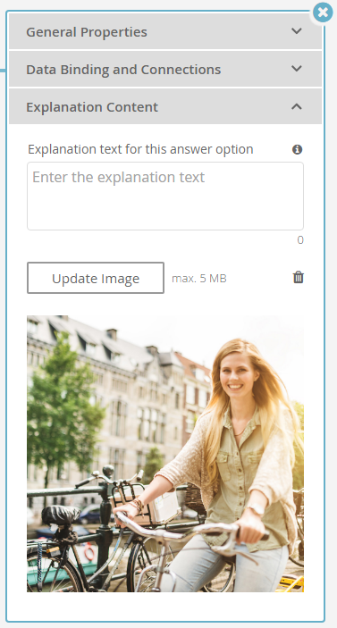
This page describes how to use and configure explanation content in your Product Guides. Explanation content is important to explain your features, give a more detailed description and provide an emotional shopping experience.
Depending on your selected theme, you can use explanation content for Stages, Questions and Answer Options.
Table of Contents:
For Which Elements Does Explanation Content Exist?
You can create explanation content for Stages and Questions and Answer Options. These explanations are shown in the live Product Advisor to explain product features and properties in more detail.
Technically, you are free to use the explanation content in any way your like - however, the following table shows how excentos recommends you to use the explanation content:
| Explanation Content of a ... | Purpose | Displayed when ... |
|---|---|---|
| Stage | Explains the topic and intentions of the Stage and provides an overview of the underlying Questions and Answer Options. | Displayed in the live Product Guide after the user enters the Stage. Depending on the theme and content of a Stage, the explanation content of a Stage will be replaced by the explanation content of a Question or Answer Option once the user interacted with one of them. |
| Question | Describes why the Question is important in the Product Guide, and optionally background information about the decision the user needs to take when choosing Answer Options of this Question. | Appears after the user clicks on the Question name or info icon attached to the Question. |
| Answer Option | Explains the features behind an Answer Option or promote why the user should select it. | Is displayed once the user selects the Answer Option or clicks on the corresponding info icon. |
Info
Please note that the way how - and if at all - explanation content is displayed depends on the theme you have selected for the user interface of your Product Guide.
Types of Explanation Content
The following sections describe the three types of explanation content you can use. All of them are independent of each other. You can use title, text or image or all at the same time, depending on which information you want to provide and which content you have available.
Explanation Title
The explanation title should contain a few key words which describe the explanation text or the explanation image shortly.
Explanation Text
Explanation text contains any kind of description text or explanation you want the user to read referred to a certain Stage, Question or Answer Option.
The length of the explanation text can be chosen freely but should be limited to a maximum length of around 300 characters. This length ensures a clean embedding of the text without disturbing the user interface. Of course depending on the selected advisor theme and font size, it is possible that the suggested length may differ.
Info: You can also use HTML-Tags to get more individual and adapted textual appearances. For example you can use:
| Name | HTML | Result |
|---|---|---|
| Unsorted List | <ul><li>Text</li></ul> |
|
| Bold Text | <b>Text</b> | Text |
| Colored text | <div style="color: green">Text</div> | Text |
| Line breaks | <br> | |
And many more ... | ||
Explanation Image
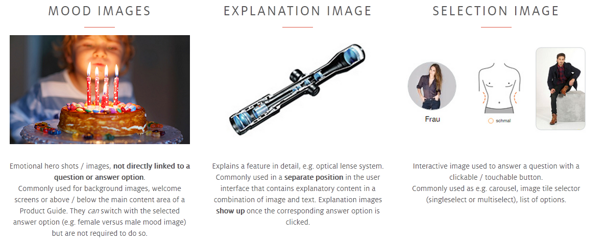
Using an explanation image extends the explanation content by a visual component. This component can address different kind of intentions:
- A mood image for a nicer look and shopping experience,
- An image which supports the explanation text with a visual extension,
- An image which shows a certain product, product piece or activity which cooperate with the corresponding Stage, Question or Answer Option,
- An image which contains visual and textual aspects and consequently combines the explanation text and image.
Of course some images are matching more than one variant. So be clear that these variants are no "Either-Or" choices.
How to Configure the Explanation Content?
The way to configure explanation content is identical for Stages, Questions and Answer Options.
- Click on the respective name of the card element which causes the properties dialog to show up.
- Afterwards open the tab "Explanation Content".
- In this tab you can see:
- a text input field for the explanation title
- a text area field to enter the explanation text and
- a button with the caption "Upload Image" to add an explanation image.
The explanation title and text will be instantly saved after the input field is left. The number below the explanation text input field shows you the amount of characters you typed in already.
Upload Image Process
- Clicking the "Upload Image" button opens your file browser window to choose a local image file.
- After selecting the file, the image is shown in the properties dialog (see example above).
Image Requirements
Independent of the image intention there are some uploading restrictions which have to be fulfilled:
- The image have to be uploaded from a local storage.
- The file size cannot be greater than 5 MB.
- The supported file types are JPEG and PNG.
After you have uploaded the image, you can update the image or delete it (see the "Trash" icon). If you click on the trash button, the image is permanently deleted from your Product Guide.
How to Produce Good Images?
There are many tips and tricks how to create good content that increases the user experience and conversion rate of your Product Guide. When producing or selecting the content, please keep in mind that - depending on the theme - it will be used in a responsive user interface and thus needs to match screen limitations and usage habits of mobile users.
excentos compiled some tips on content that also shows different ways of presenting buying decisions:
Please note that not every presentation is available or suitable for each theme.


