You are viewing an old version of this page. View the current version.

Compare with Current View Page History

Version 1

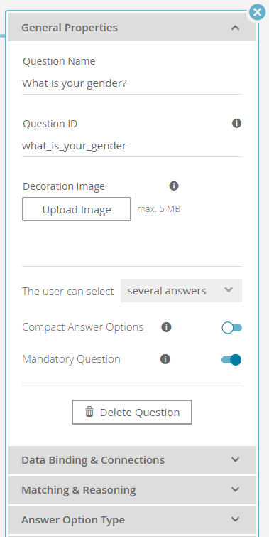
The general properties tab in a Question's properties dialog contains all basic settings that can be configured for a Question.


Table of Contents:

Structure


Clicking on a Question cards' name opens the properties dialog. The "General Properties" tab is located at the top of the properties dialog.

The tab contains the following elements:

  • Question name:
    You can change the Question name in this text input field. That name is displayed within the live advisor.

  • Question ID:
    The Question ID is used to identify the Question without needing the label name. This is useful for the tracking, binding of visibility conditions (see Conditioned Visibility) and reusing of an existing Question.

    If the Question name is empty the Question ID is shown in the concept board (recognizable by a thinner font weight and italic design). This is just a feature for an easier Question identification. The ID is not shown in the Advisor.

  • Decoration Image:
    Next to the name it is also possible to upload a decoration or background image for a Question. For an image-based client theme this feature could be useful for a better user experience. An uploaded image is also displayed on the left-hand side of the Question name in the question card as a preview image.

  • Single vs Multiple selection:
    see "One answer" versus "Several Answers"

  • Compact Answer Options:
    see Compact Answer Options

  • Mandatory Question:
    With enabling this toggle button you can set a Question to mandatory or required. That means that this Question has to be answered to complete the Stage and to advance to the next Stage within the client (live Product Guide). Without an answer (doesn't matter which one in particular) you cannot use the next button to go to the next Stage.

    Info

    It is further possible to mark multiple Questions in one Stage as mandatory. In that case all of them have to be answered the advance to the next Stage.

  • "Copy Question" button:
    When you click on the "Copy" button a modal window appears in which you can decide where the Question should be copied and whether it should be linked to its original or not. For more information see Copy Question Modal Window.

  • "Delete Question" button:
    The "Delete Question" button removes the Question card from the Stage. All containing Answer Options are irreversibly deleted as well.


"General Properties" of a Question

"One Answer" Versus "Several Answers"


You can decide whether the end-user can select one or multiple Answer Options within the corresponding Question.

  • One answer implies a "either-or" choice. That means the user can only choose one of the available Answer Options.
    • e.g. the Question "Which gender do you have?"
  • Several answers are useful if the user may select multiple Answer Options at the same time.
    • e.g. the Question "Which bike types do you like?" with the answer options "race bike" and "mountain bike" and "BMX"


Note

The settings in the Concept Board are independent of the widgets displayed in the resulting Product Guide. That means that "one answers" can be displayed e.g. as radiobuttons as well as tiles or a dropdown. 

The same applies to "Several answer". These can be visualized e.g. as checkboxes or tiles, too. excentos will add widget configuration options in later versions of the Workbench.

Compact Answer Options


For Questions with a large number of Answer Options (e.g. for colors or manufacturers) a compact presentation in the Product Guide can be useful. It reduces the amount of screen space needed for displaying the Answer Options. Activating the corresponding switch button enables the compact view for the Question. The widget depends on whether the Question can have one or several answers:


Compact Answer Option Illustration is ...

A Question where the user can select ...disabledactive
... one answer

A "one answer" Question with "Compact Answer Options" disabled can be visualized with radiobuttons. Every Answer Option is listed at once.

A "one answer" Question with "Compact Answer Options" enabled can be visualized as a dropdown widget. Only the selected Answer Option is visible, until the user opens the dropdown list.

... several answers

A "several answers" Question with "Compact Answer Options" disabled can be visualized with checkboxes. Every Answer Option is listed once.

A Question where the "Compact Answer Options" is enabled has a fixed height with scrollbars.

Read on: Data Binding and Connections

  • No labels