After you have successfully uploaded the product data, the view contains two new components: the control bar and the data attributes table.
Control Bar

The control bar includes some meta information and action buttons:
- File name:
The name of the uploaded file - Last Update:
The date of the last successful upload/update of the file - Status icon:
A check mark icon indicates a successful upload, an exclamation mark indicates an upload with errors - Products:
Number of different products within the file - Attributes:
Number of different attributes every product has - Properties button:
Opens a modal window where you can map some core attributes (display important information in your product recommendations) to your data attributes. Furthermore you can define the character (sequence) to split multi values. - Import Filter button:
Opens a modal window where you can refine your data file. The Include filter reduces the data file to all products which match the selected attribute values. The Exclude filter removes all products which match the selected attribute values. - Show Data button:
Shows the uploaded product data table. - Download button:
Downloads the currently used data file. - Remove button:
This button removes the uploaded file completely and changes the view back to the start view.
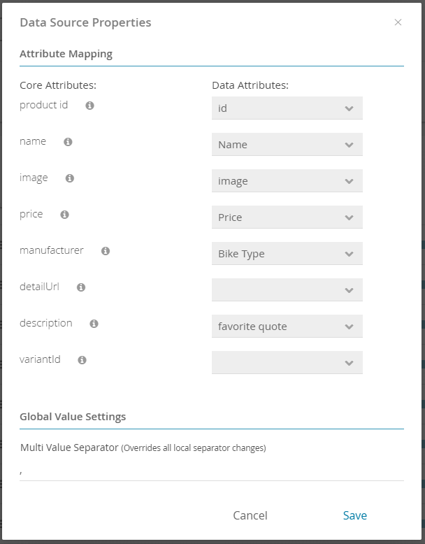
Data Source Properties
Within that modal window you can edit the attribute mapping which was initially shown during the upload process of the product data (see Attribute Mapping).
Also you can define a global value for the multi value separator. As a consequence all attributes with enabled multi values use this separator. Note that each attribute can override the value within the Data Attribute Values modal window.
Data Attributes Table
The data attributes table contains a list of all attributes that each product has. Furthermore, every attribute is extended with some meta information which also can be seen in the table.
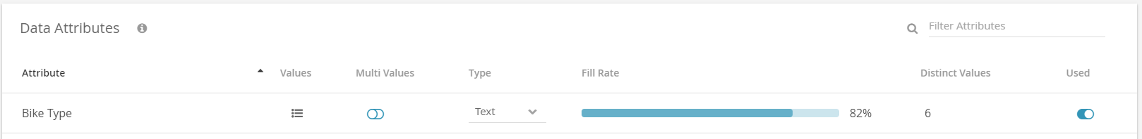
- Attribute:
Displays all column headers of the uploaded file. Every attribute contains a set of different values. - Values:
Opens a modal window which displays all distinct values of the respective attribute. Furthermore you can define an attribute specific multi value separator. - Multi Values:
By activating this switch button all attribute values which are separated by a ',' (comma) will be interpreted as individual values for the corresponding attribute.
Example for attribute color: the value "black,blue" will be converted into the two values "black" and "blue" - Type:
The "Type" determines which kind of data the attribute has. Changing the type causes a conversion process. That means that each value of the attribute will be evaluated whether a conversion to the new type is possible. If one of these values cannot be converted, a type change is not possible and causes the appearance of a warning message. Note that empty cells don't generate any conflicts but cells which include terms like "none", "null" or "-" are interpreted as strings and therefore cause errors by converting them into "Number" or "Boolean".
The three possible types are shortly described below:- "Number" describes a natural or decimal number format (e.g. 799.99)
 Note: At the moment only dot-separated decimals can be converted into a "Number", comma-separated values like 799,99 are not supported right now. Note: Empty value representations like "#NULL!" are also not supported. Respective data cells have to be emptied beforehand!
 - "Boolean" describes a boolean type (such as yes/no, true/false or 1/0 pairs)
- "Text" can contain all kinds of input
- "Number" describes a natural or decimal number format (e.g. 799.99)
- Fill rate:
Describes how much the attribute is filled with values (in percent). This is helpful to see if some products have no values for the corresponding attribute. - Distinct Values:
Shows the number of different, unique values for the corresponding attribute. - Used:
By activating the switch button the attribute can be connected to a question in the concept board. Otherwise this attribute is not selectable. - Filter Attributes:
By entering text in this input field the table will be filtered by all attribute names which contain the text.
All these descriptions are also readable in the info icon right next from the "Data Attributes" title.
After a successful data upload all attributes can be connected to questions in the "Concept Board" (see Data Binding and Connections). If you haven't created any questions or even entered the "Concept Board " right now please go to the pages Create the Product Guide Concept or Questions and Answer Options.
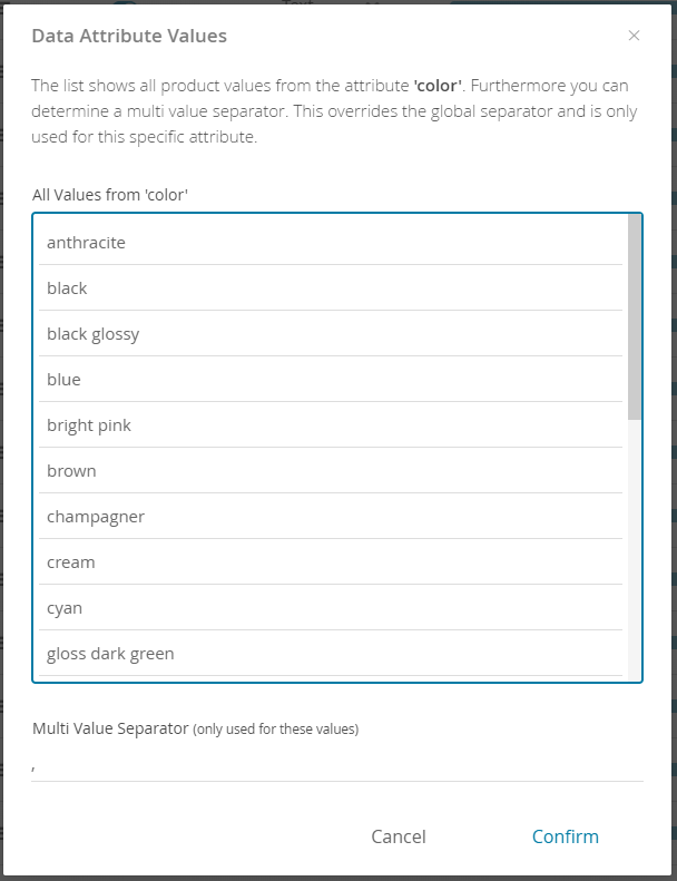
Data Attribute Values
The modal window contains a list of all values of the corresponding attribute.
Furthermore you can configure the multi value separator. This character or string splits a value into multiple values. The input field is only enabled if the multi values toggle button from the data attributes table is enabled for this attribute.
Example for attribute color: the value "black,blue" will be converted into the two values "black" and "blue" with the separator ",".
Read the Prepare the Product Data section that contains information about the Product Data Feed Requirements and a Template and Example Data Files to produce CSV files that you can directly upload to the excentos Workbench.